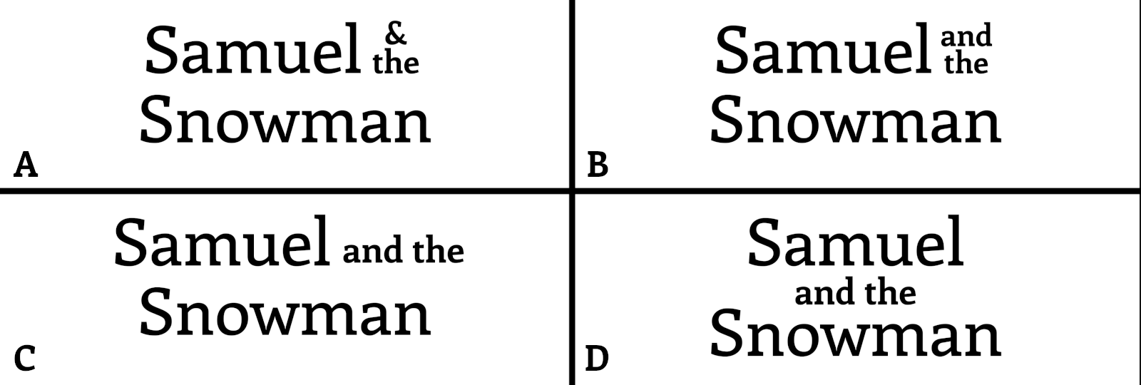
Shaltif: A friend of mine is writing a book and was wondering which way layout is the best to go with for his story. I gave him my opinion, but was curious which you would select?
Shaltif: A friend of mine is writing a book and was wondering which way layout is the best to go with for his story. I gave him my opinion, but was curious which you would select?
ChatGPT: Based on the four options (A, B, C, and D), the choice depends on the tone and visual style your friend wants to convey for the book. Here's a breakdown of each:
### My Recommendation:
If your friend’s book is a whimsical or modern children’s story, **A** could be the best choice. For a traditional or narrative-driven story, **B** might work better for its simplicity and balance. If the story heavily revolves around the character, **C** could emphasize their importance. **D** would be best if they want a slightly unconventional look.
Which option did you suggest to your friend?
Shaltif: Huh, a rather fascinating observation. I suggested the D option as I felt it was the easiest to 'read' of the 4 options, but it's interesting to read your observations.
ChatGPT: Your choice of option D for its readability makes a lot of sense. Its distinct layout does draw attention to each element of the title, making it easier for readers to process. It’s always interesting how different perspectives can highlight unique aspects of a design—yours emphasizes clarity, while others might focus on tone or balance. It sounds like your suggestion was thoughtful and well-suited for the context!
Shaltif: Curious, would you think the 'The' part should be the same 'strength' as Snowman? So something like Samuel and The Snowman?
ChatGPT: That's an excellent question, and it really depends on the tone your friend wants to convey. Making "The" as strong as "Snowman" could add a sense of balance and elevate its prominence, but it also changes how the title feels overall. Here's how it could impact the design:
### If "The" Matches the Strength of "Snowman":
### If "The" Remains Less Prominent:
### My Suggestion:
If the story's tone is lighthearted or geared towards younger audiences, keeping "The" less prominent might work best, as it keeps the focus on "Snowman" and feels approachable. However, if the story is more formal, timeless, or even epic in tone, elevating "The" to match "Snowman" could add a touch of sophistication.
Would you like to see a layout mockup or deeper exploration of this adjustment?
Shaltif: Huh.. yeah sure, I'd be curious what you mockup would look like.
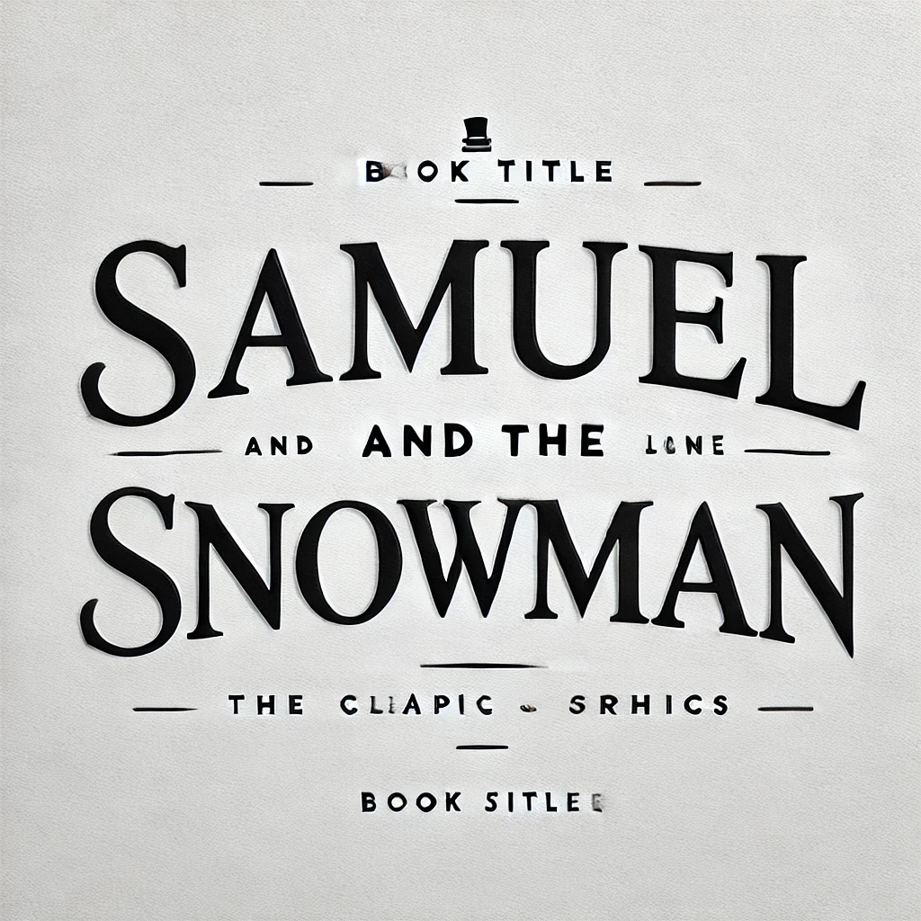
ChatGPT: Here's a mockup of the title layout where "The" is given equal weight and size as "Snowman." This approach creates a balanced and cohesive appearance for the title. Let me know your thoughts or if you'd like any adjustments!
Shaltif: hahaha... ah yes.. I don't know what I was truly expecting, but that wasn't it.
ChatGPT: Haha, I completely understand—it’s always fun to see how ideas translate into visuals! If the mockup didn't quite match your vision, let me know how you'd like it adjusted, and I'll refine it further. We can tweak the font styles, proportions, or alignment to get closer to what you were imagining.
Shaltif: Nah, that's alright. I was just mostly curious what you would produce.. and well, I guess in some way you didn't disappoint.
ChatGPT: Haha, fair enough! I'm glad I could at least give you a good chuckle with that one. If you ever have another curious idea or need a design mockup (or just a bit of amusement), feel free to let me know! 😄